Skip to successes (case studies)
Go back Go back

International Wealth Management

Wealth management teams waited weeks on developers and vendors for client reports. I designed a self-serve insights platform that delivers custom reports in seconds and gives back up to 7 days of manual work.

Overview

I turned a scattered, request-driven reporting process into a self-serve insights platform for Morgan Stanley's wealth management professionals. What started as a concept became an MVP that puts real-time insights and visualizations in their hands, so decisions happen faster and with more confidence.

Problem

Advisors and managers depended on development teams and vendors for client data, which arrived as fragmented Excel files stored in different places. Every report meant manual consolidation: slow, error-prone and a poor way to spot opportunities.

My role

I led UX strategy, research and design, taking the product from initial discovery to the launch of a fully functional MVP.

Key outcomes

Smooth launch

Smooth launch

The MVP shipped with virtually no usability issues, thanks to a truly human-centered process

Seconds, not weeks

Seconds, not weeks

Custom business reports on demand, with no developer requests

Instant visual stories

Instant visual stories

Data becomes a visual story in seconds instead of hours of manual Excel work

Trends at a glance

Trends at a glance

Business performance trends spotted in seconds

How I started

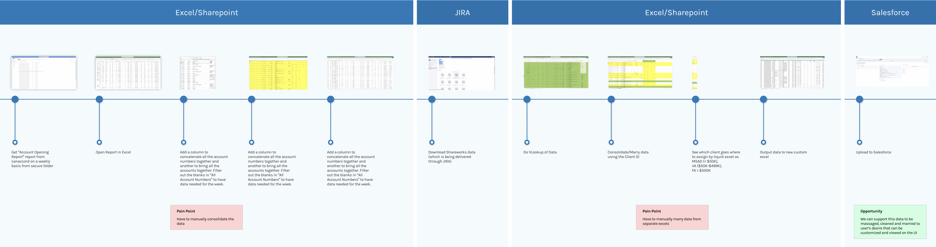
I mapped the current process end to end around one high-value use case: acquiring Virtual Advisor clients, individuals with $50,000 to $499,000 in liquid assets. One-on-one interviews showed me every step users took to reach that goal, and exactly where the friction was.

Current user journey: weekly Account Opening report pulled from Excel/SharePoint, Shareworks data from JIRA, consolidated in Excel, then uploaded to Salesforce, with pain points at the manual consolidation steps

View the full user journey (PDF) (opens in a new tab)

Pain points

Manual data consolidation

Users constantly merged and added columns across Excel spreadsheets just to make the data usable, which cost time and invited errors.

Outdated data

Shareworks data depended on manual developer effort and was often stale.

Cumbersome Salesforce updates

Updating client financial information meant a manual upload, adding another step and another chance for error.

Opportunities

Automate the cleaning, consolidation and customization of the data, then put it behind an intuitive UI. Users tailor the information to what they need and act on it right away.

Personas

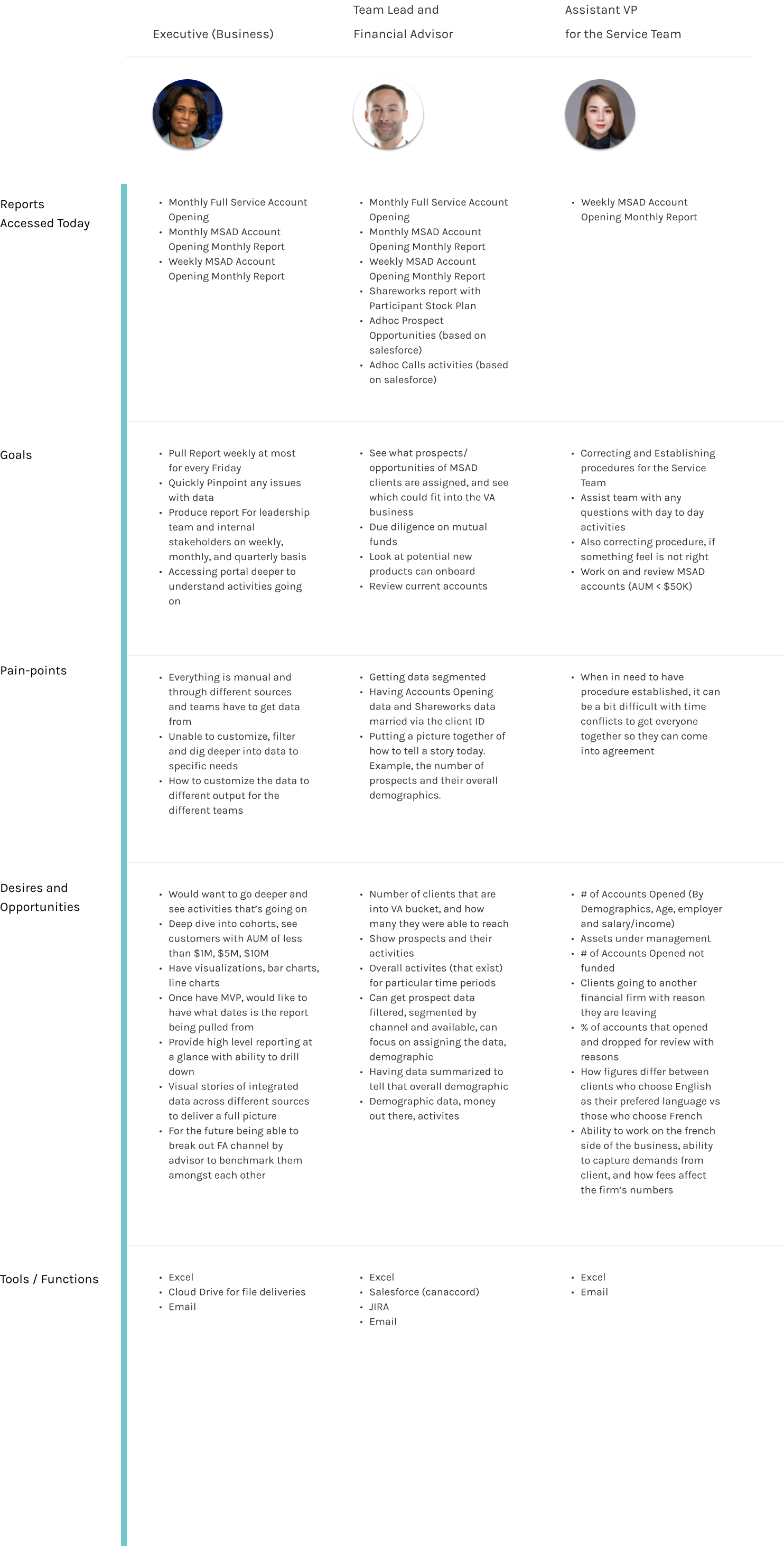
This team had never worked with personas. Interviews across each user group gave me distinct personas with their own goals, pain points and opportunities, and made sure the solution served every workflow, not just the loudest one.

Canada Wealth Management Personas

Strategy

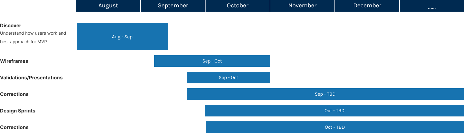
With a few months to design, I focused on a feasible MVP that met the essential business needs, built to scale into a suite of wealth management products for strategic business users and branch managers. The business chose to start with Financial Advisor (FA) and Virtual Advisor (VA) data.

  • The right users — I worked with the business to identify key users, so I could design for the MVP and the near term with a clear view of their processes, pain points, needs and goals.
  • Iterate to clarity — I turned research into concepts and refined them continuously: data layout, presentation, visualization, navigation and basic customization.
Canada Wealth Management Timeline

Wireframe concepts

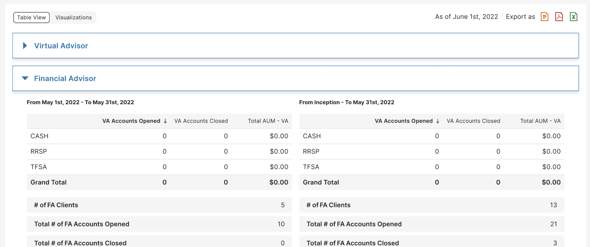
I sketched layouts around how users search for and extract data, matching their mental models. The priority was an information architecture that made filtering fast and accurate, because users mainly compare a specific period (a week, month or quarter) against data since inception.

  • A — Grouped and stacked — FA and VA data grouped and stacked, with date-range comparisons side by side.
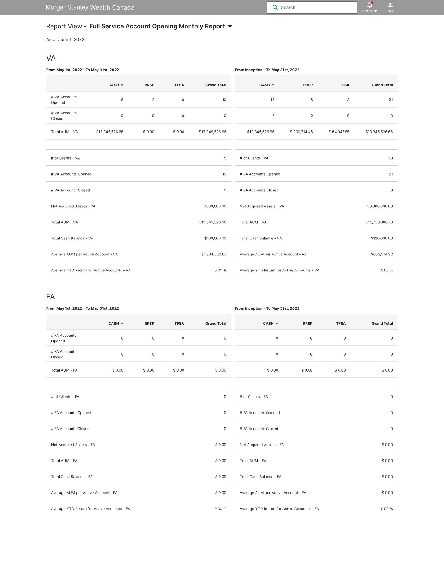
    Canada Wireframe Concepts A
  • B — Summary first — FA and VA data segmented, each starting with a summary, with date-range comparisons side by side.
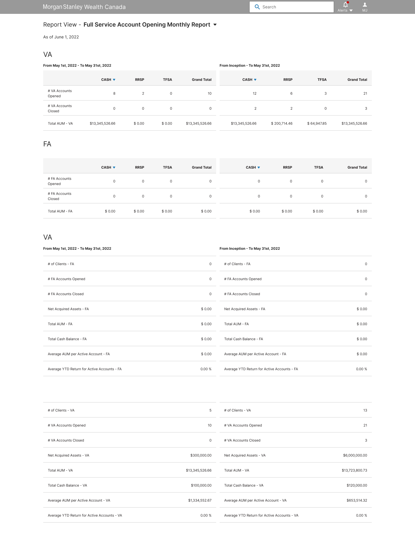
    Canada Wireframe Concepts B
  • C — Single table — FA and VA data stacked together, with date ranges as adjacent columns in one table for cross-referencing.
    Canada Wireframe Concepts C

Users and product stakeholders chose Version A for its readability, so I refined and built on that direction.

Interactive design

I brought the design to life with interactive elements, prioritizing the filters and features that mattered most for the MVP. Every feature traced back to a user requirement, and I tested in stages, refining each component until the experience converged.

Canada Wealth Management MVP

Features

  • One view for what matters most — FA accounts ($500K+ in liquid assets) and VA accounts ($50K–$499K) share a single tab, because users watch them closely for their revenue potential. MSAD accounts follow a different growth strategy, so they got their own grouped report, organized by sponsoring company.
    Canada Wealth Management MVP tabs
  • Filters built for each job — Each tab has filters tailored to its users. The first tab compares any two time periods, the key need from research, so users answer their own questions without waiting on developers or third-party data hosts.
    Canada Wealth Management MVP filters
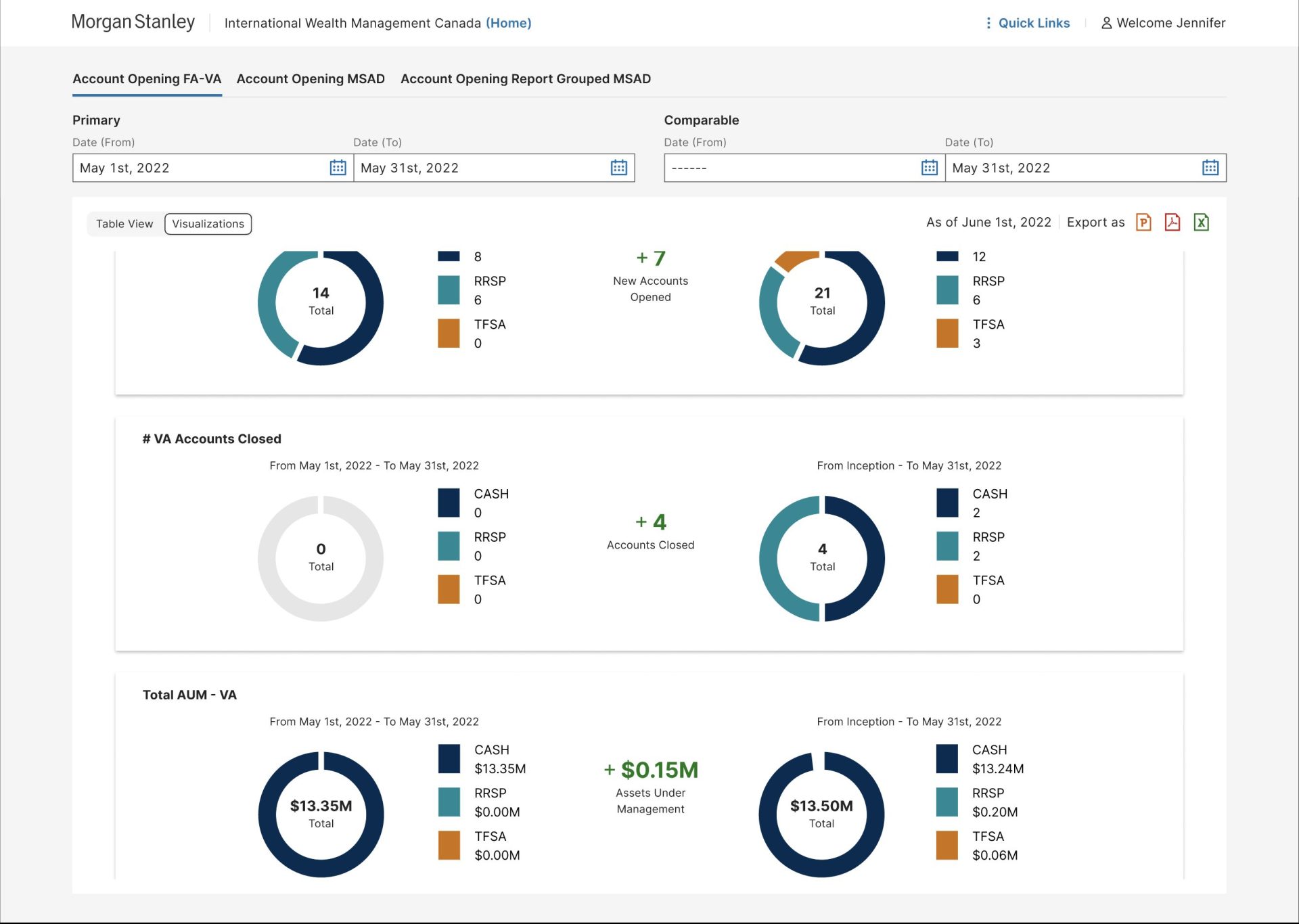
  • Tables and charts — Testing showed mixed preferences: some users wanted visualizations, others tables for detailed analysis. I kept both. Half of the users found a pie chart especially useful, so I added it as an option.
    Canada Wealth Management MVP visualization pie
  • Ready to share — One-click export to PowerPoint, PDF and Excel supports meeting prep and reporting in whatever format users need.
    Canada Wealth Management MVP export
  • Easy to navigate — I tested tabs, expandable sections and simple headers for switching between FA and VA data. Users preferred scrolling with the option to collapse sections, so that's what I designed.
    Canada Wealth Management MVP Expand and Collapse
  • Insights at a glance — I added calculated differences to the pie chart, showing the change between the two date ranges. It was one of the most appreciated features in testing.

Summary

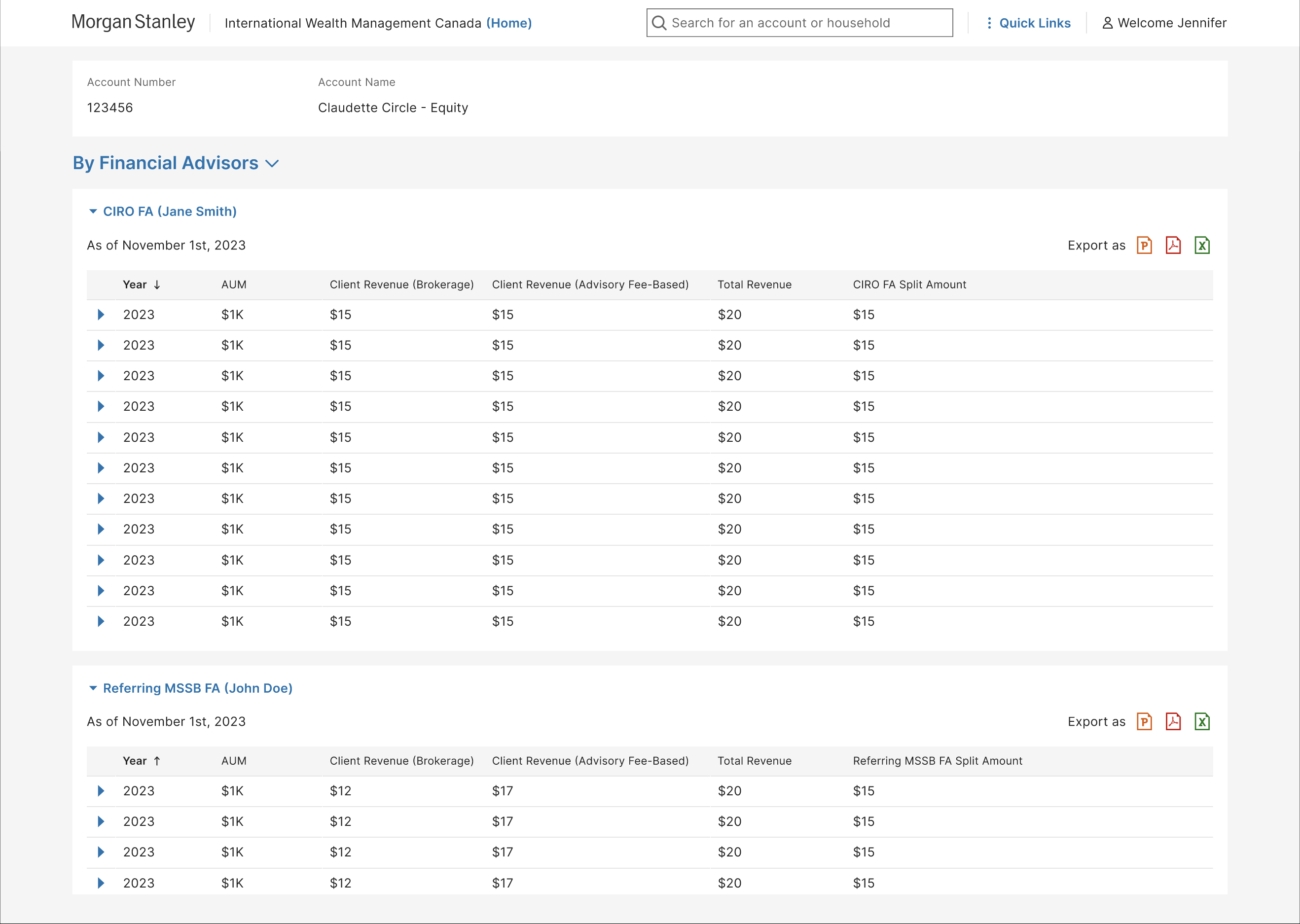
This team grew to trust the UX process. It took some early education and working through pushback, but it became a strong partnership. Working closely with users at every iteration, I designed a scalable, modular system that absorbs new enhancements easily.

Canada Wealth Management Post MVP Financial Advisors Report
  • Human-centered and accessible — A true human-centered process with accessibility built in delivered high usability and fast adoption after launch.
  • Design and code together — I worked closely with the development team, including a skilled Angular developer, to fill gaps in Morgan Stanley's then-young design system. Drawing on my development background, I ran visual QA and made experience and CSS adjustments myself to keep the product polished.
  • Teaching the process — The team was new to UX and expected it to run like agile from day one. I showed why UX needs a more deliberate start for research and MVP design; after launch, I moved the work to an agile cadence for new features.
  • Beyond the MVP — After launch, I kept reducing reliance on developers: contract code mapping to financial advisors for billing, transaction mapping for accurate payments, account details by year or advisor, and reports for fund managers.