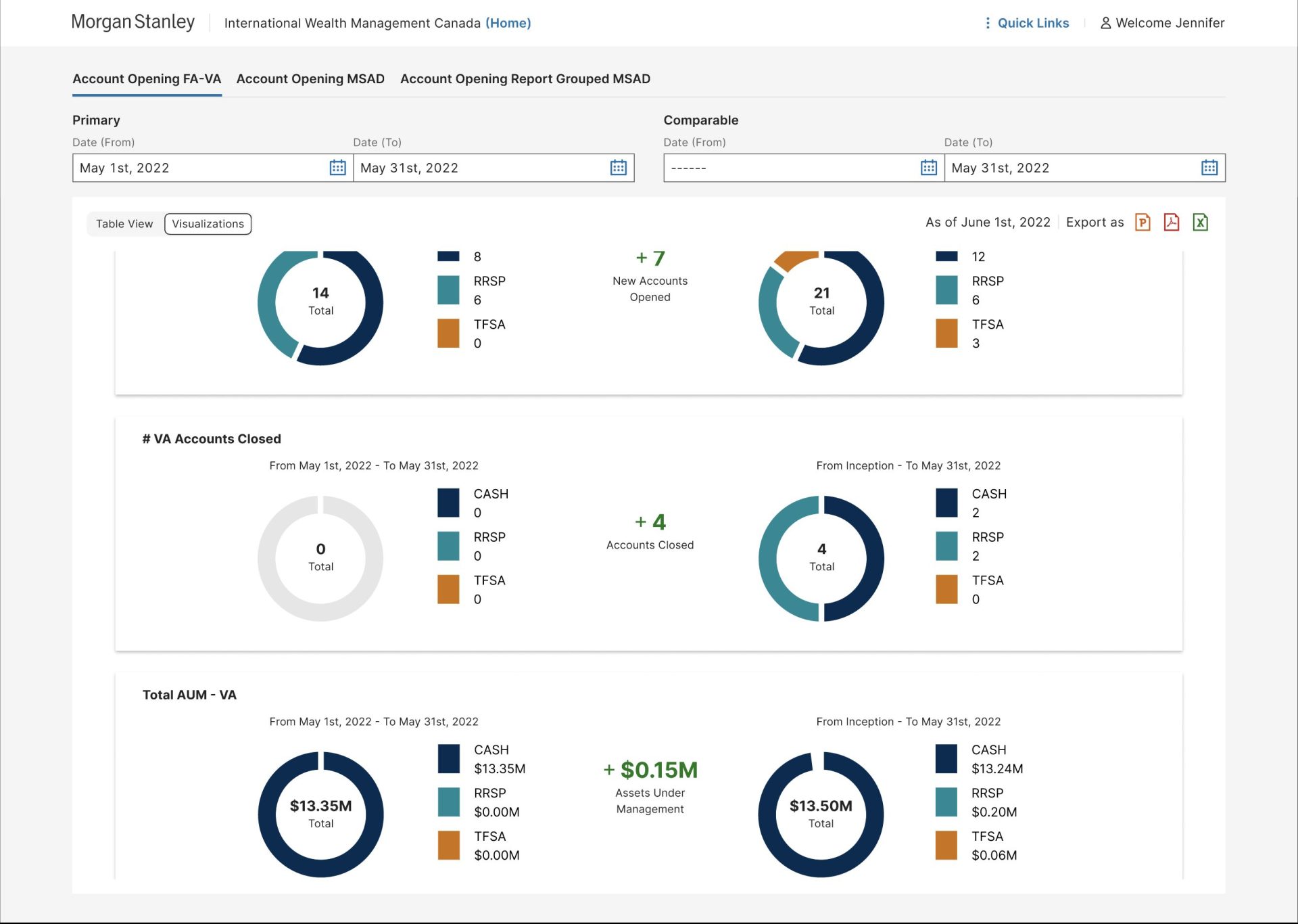
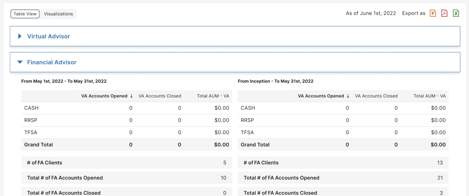
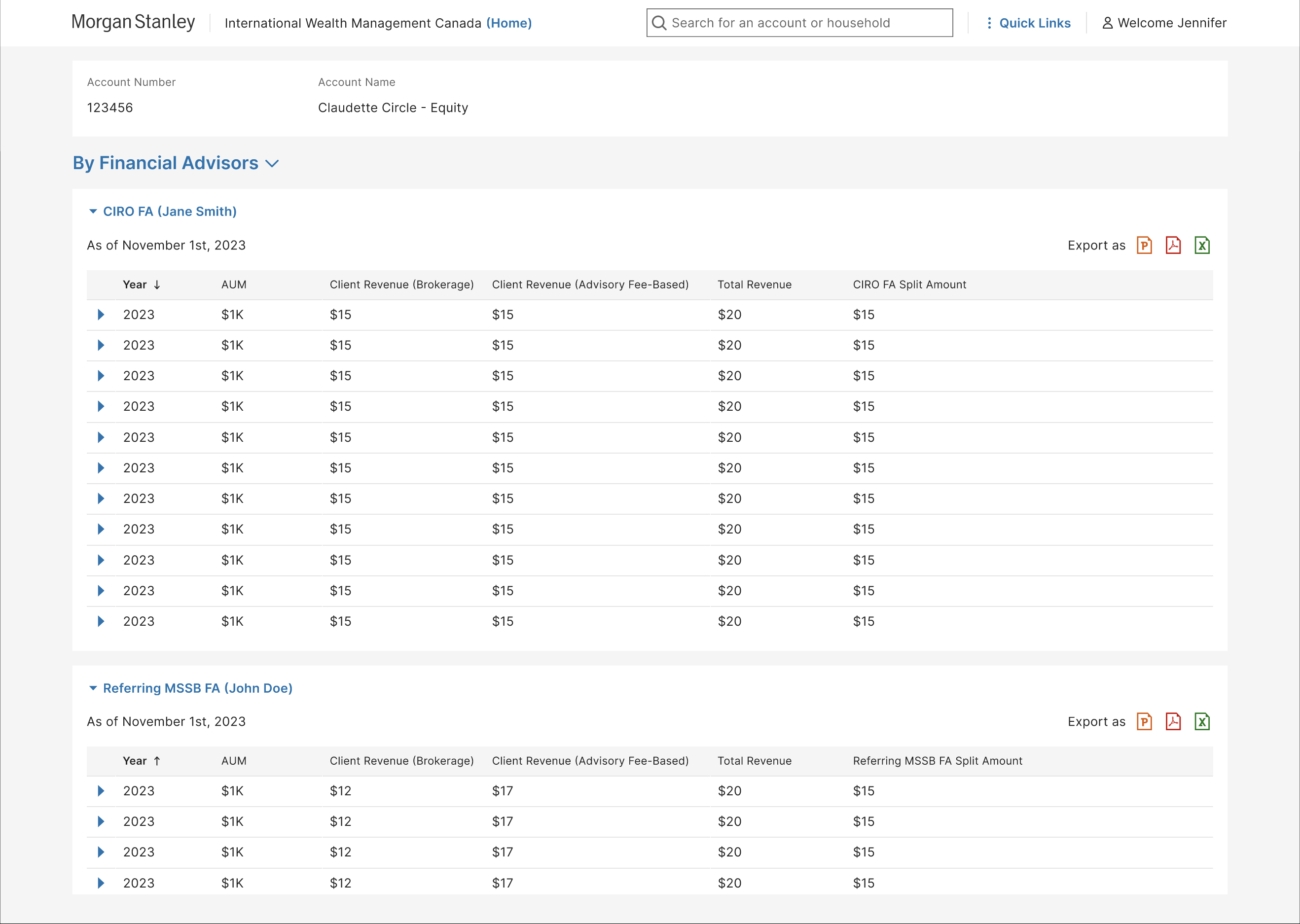
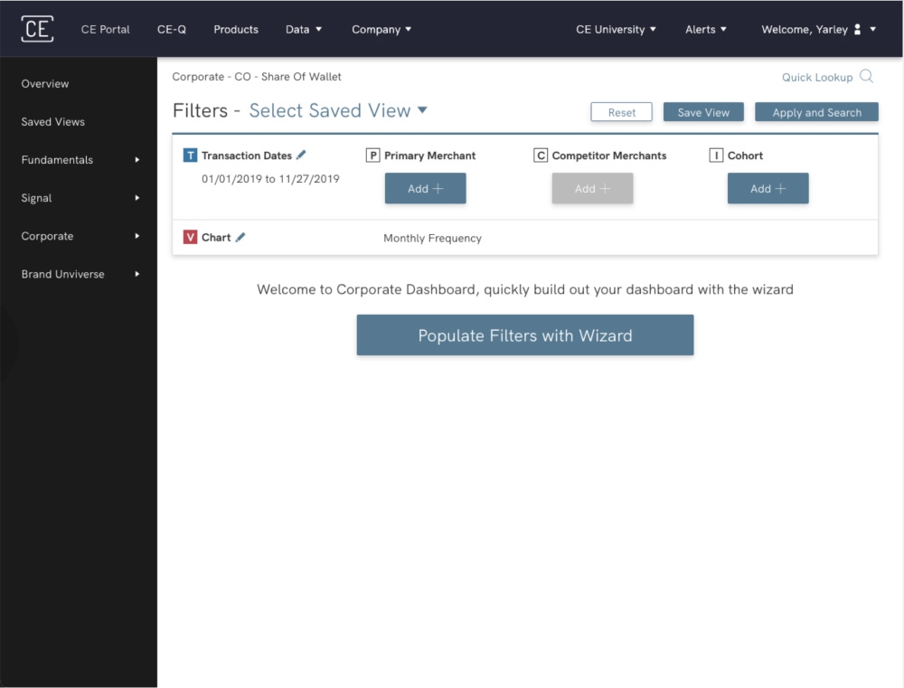
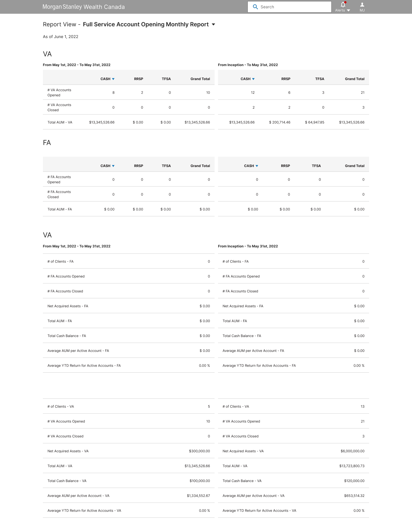
I sketched layouts around how users search for and extract data, matching their mental models. The priority was an information architecture that made filtering fast and accurate, because users mainly compare a specific period (a week, month or quarter) against data since inception.
- A — Grouped and stacked — FA and VA data grouped and stacked, with date-range comparisons side by side.
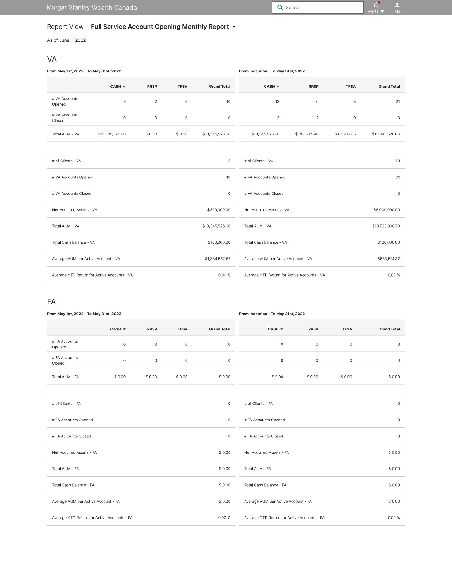
- B — Summary first — FA and VA data segmented, each starting with a summary, with date-range comparisons side by side.
- C — Single table — FA and VA data stacked together, with date ranges as adjacent columns in one table for cross-referencing.

Users and product stakeholders chose Version A for its readability, so I refined and built on that direction.
 Book Time
 (347) 668-5684
 ygeffrard@gmail.com
 Go back