Skip to successes (case studies)
Go back Go back

Mutual Funds Proxy

I replaced paper forms and DOS screens with one responsive platform for Broadridge's mutual fund proxy team, cutting a typical task from about 70 minutes to 25.

Overview

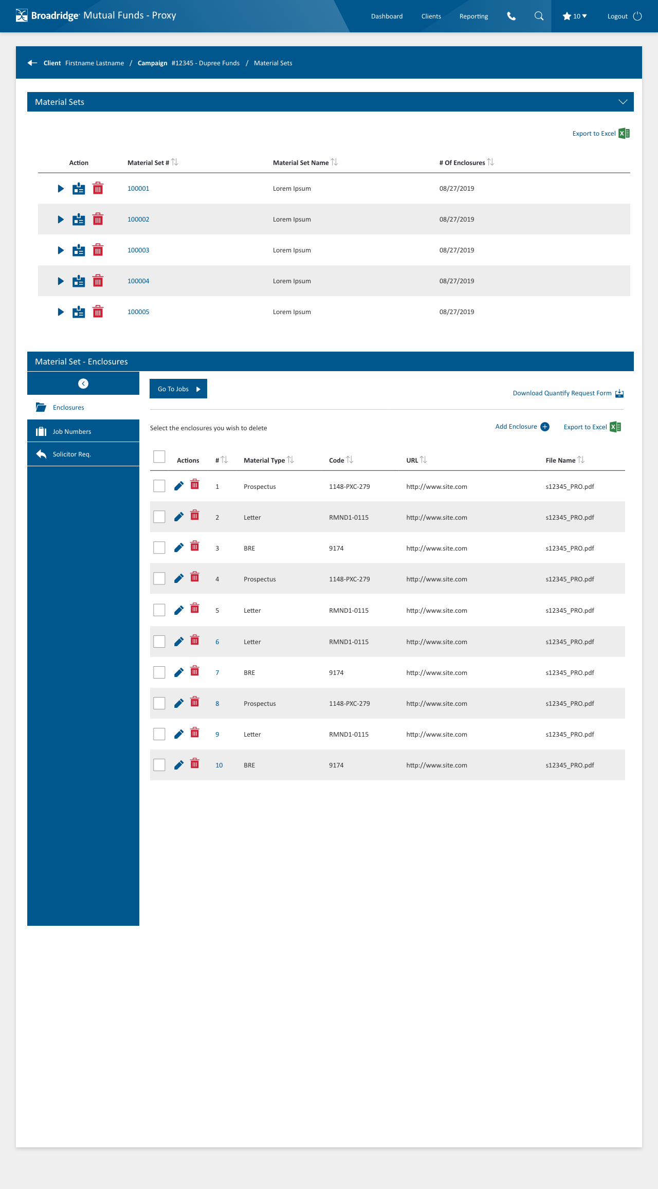
Broadridge Financial delivers investor communications for the world's largest financial institutions and investment companies. Its internal teams built campaigns, material sets and jobs through paper forms and DOS screens. I replaced that with a responsive web platform, designed from the ground up. As lead UX/UI designer, I worked closely with business users and the lead developer to resolve development complexity before it reached the build.

Test results

I tested speed and productivity on three end-to-end tasks:

~25 min per task

~25 min per task

Average across three end-to-end tasks, down from about 1 hour 10 minutes (live observations)

98% findability

98% findability

Found fields where they expected, at least somewhat easily. I kept the groupings users knew and added a few (survey)

Pain points

A deep hierarchy

Think of a tree: every branch has fruit to pick and sub-branches to explore, and every sub-branch does too, down to the last level, where there's only fruit

No reference point

No comparable system existed to study, and users worked across several legacy systems, some of them unfriendly command-line tools

Information overload

Too much information to manage

Requirements

One integrated, WCAG 2.0 AA compliant system where users add and edit records in six areas:

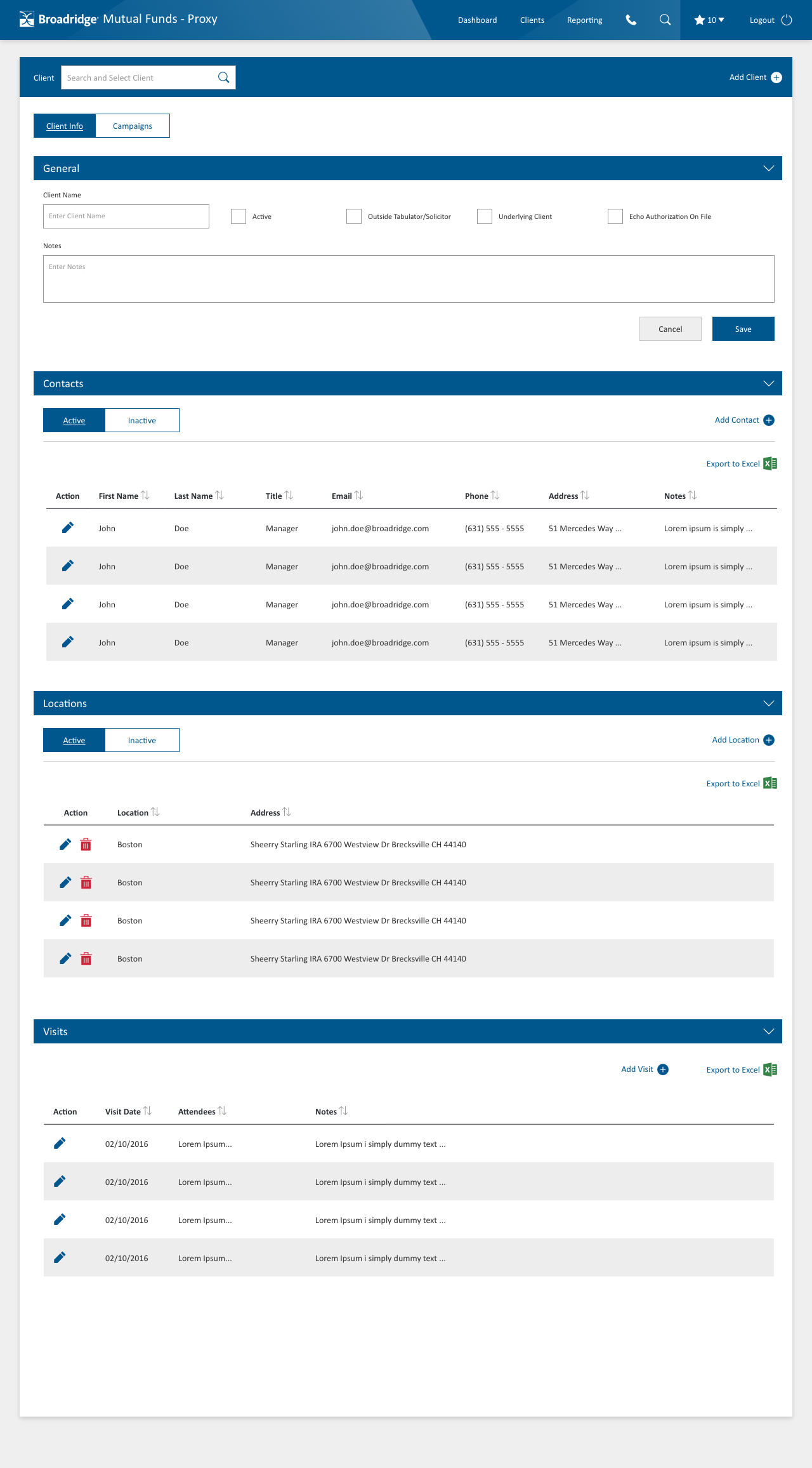
Client

  • Contacts
  • Locations
  • Visits

Campaign

  • Contacts: Broadridge campaign team associates and client campaign contacts
  • and more

Material Set

  • Enclosures (materials)
  • and more

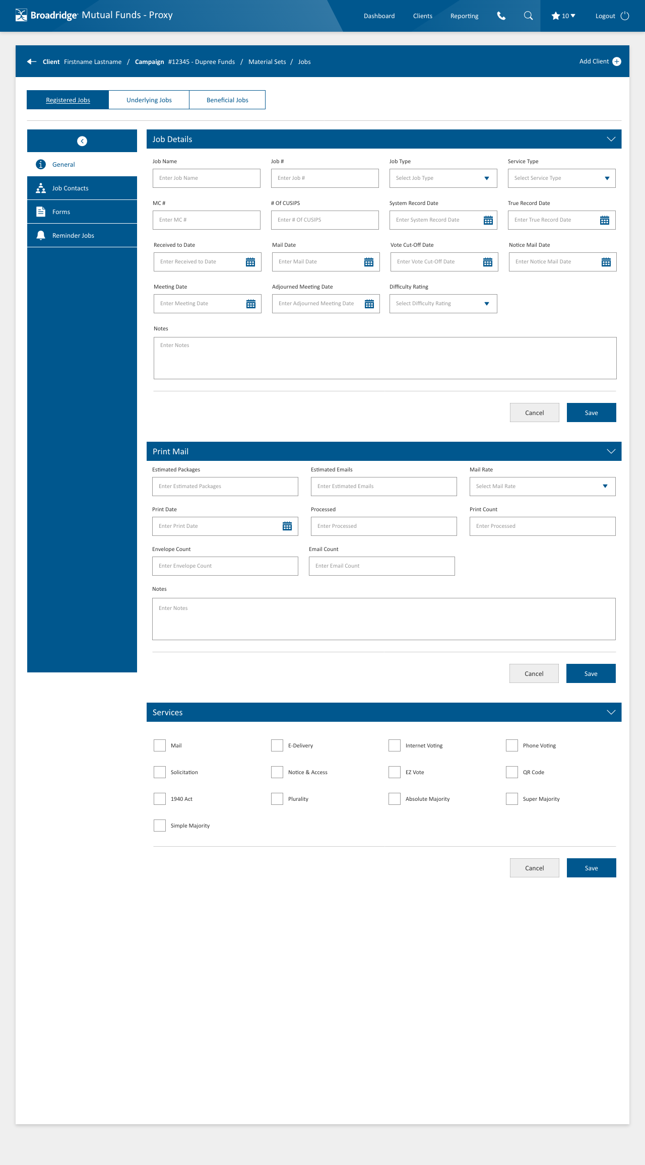
Registered Job

  • Print mail sublevels
  • Contacts: Broadridge campaign team associates and client campaign contacts
  • Reminder jobs

Underlying Campaign

  • Main Z jobs: job mailings, individual Z jobs and reminder jobs
  • and more

Beneficial Job

  • Beneficial jobs

Information architecture

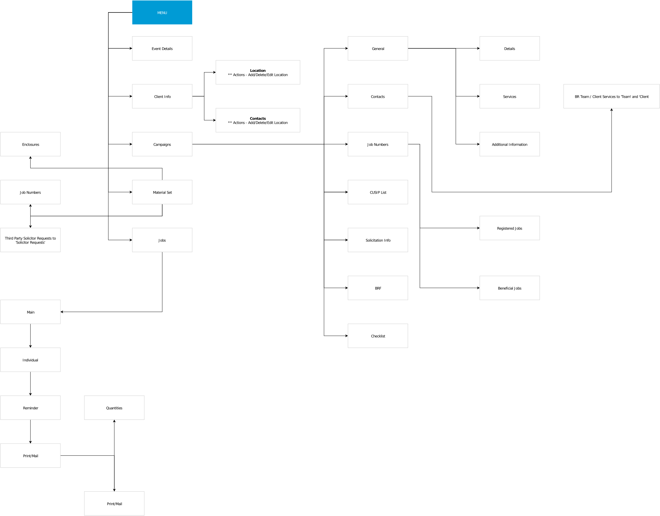
  • Smart nesting was the key to making a deep hierarchy feel intuitive
  • The industry's terminology is standard and fixed, so I focused on grouping where it made the biggest difference
  • My users and subject matter experts were in-house, so I could iterate on grouping and field order quickly
  • I studied the underlying process itself, not just the way it was done at the time
Mutual Funds - Information Architecture Excel
Mutual Funds - Information Architecture

User flow

Mutual Funds User Flow
Process

Hypotheses

Fewer, longer groups

I usually keep groups to six fields or fewer. Here, too many groups would hurt more than long ones, so some groups hold up to 20 fields, made readable with generous spacing.

Room to refine

Real-world use and changing regulations will reveal where fields and groups can shrink further, and the platform is built to make those refinements easy.

Innovations

  • Smart suggestions

    Suggestions on input fields cut the time spent on repetitive tasks.

  • At-a-glance dashboard

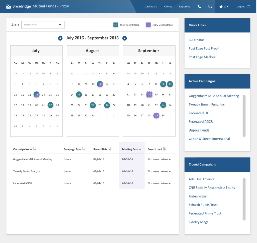
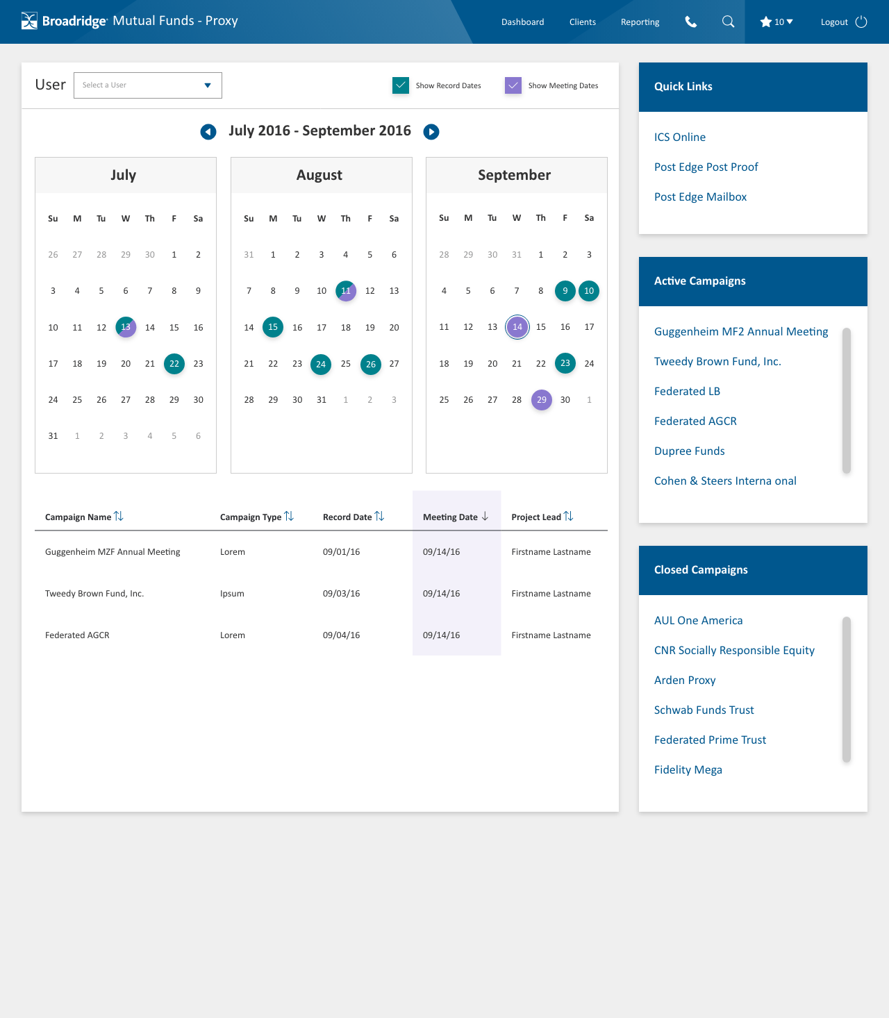
    Recent activity, key information and a calendar, so users see at a glance what needs their attention.

Final designs

Visual design

Colors

Data-heavy, so a minimal color theme

Dark gray for all text

  • #333333

The company's design system set the accent color and green checkboxes; I added two colors for the calendar

  • #007BB6
  • #348347
  • #8978CF
  • #00818C

Typography

Calibri

Readable and modern, handles numbers and text equally well

Buttons

A business look and feel with a small corner radius

PrimarySecondary