Skip to successes (case studies)
Go back Go back

CE Vision

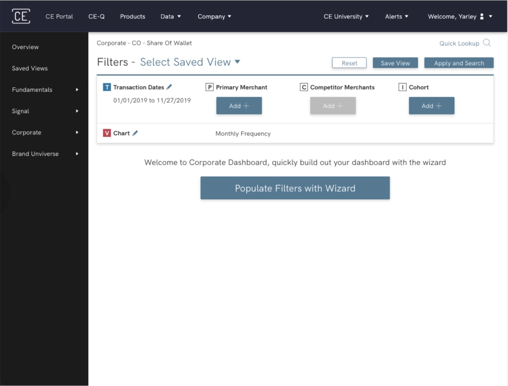
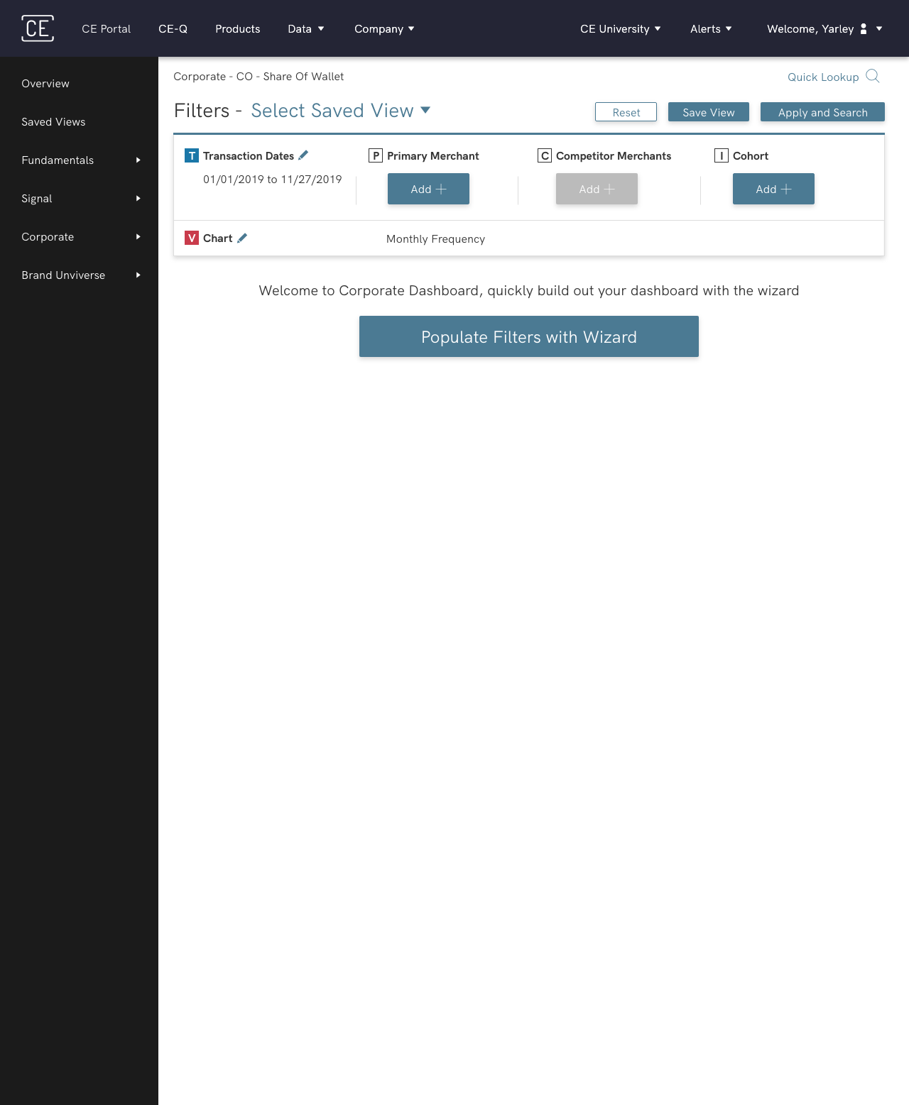
I redesigned Consumer Edge's consumer-spending research tool so investors, hedge funds and corporations get to answers in 1–2 minutes instead of 4–5, with a guided path for new users and a deeper one for experts.

Overview

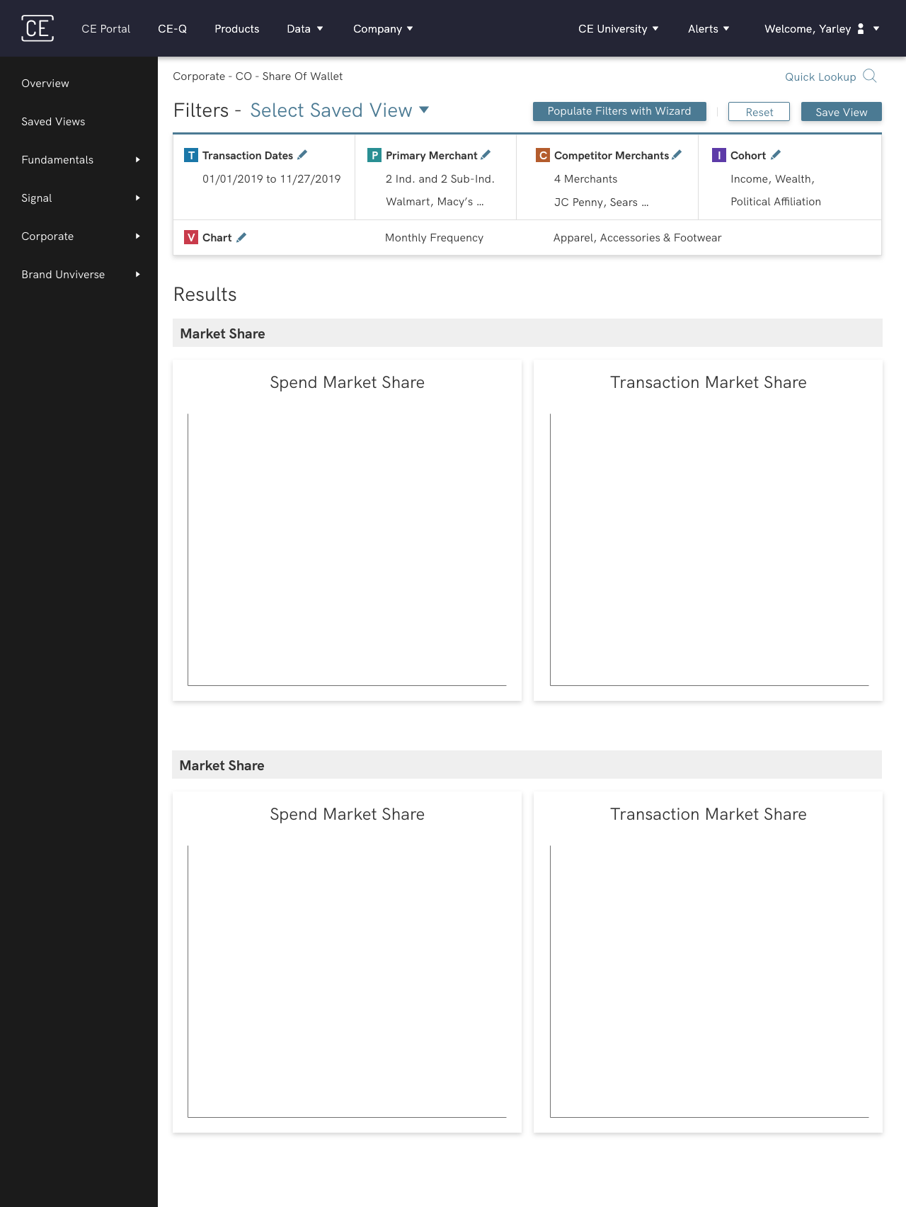
I redesigned the research tool that investors, hedge funds and corporations use to explore consumer spending data from Consumer Edge, a SaaS data research company. The new experience cuts through the noise of the original system and makes research streamlined and intuitive. As lead UX/UI designer, I worked with stakeholders, the product team and data analysts.

Key outcomes

1–2 min searches

1–2 min searches

A simple search now takes 1–2 minutes, down from 4–5, giving users back 50–60% of their time.

A year of learning

A year of learning

Advanced search spans many flows and chart types, and clients compare year over year as trends shift. I planned a year of machine-learning analysis to learn the most common searches and their paths, how long each type of search takes, and how spending trends change which fields people research.

Pain points

Hard to find fields

Users weren't sure where to find the fields they needed.

A slow system

The system was too slow, holding up research.

Clunky and unintuitive

The experience felt clunky and hard to learn.

Too many clicks

Simple tasks took more clicks than they should.

Requirements

  • Intuitive research

    A more intuitive research experience.

  • A simple path

    A simple path for less experienced users.

  • An advanced path

    An advanced, well-organized path for experienced users.

Information architecture

  • The architecture largely follows industry convention (income range sits under Demographics, for example)
  • Data analysts were my subject matter experts, closest to the industry and its clients. I reorganized where it helped, while making sure nothing was more complex than it needed to be and everything sat where users expected
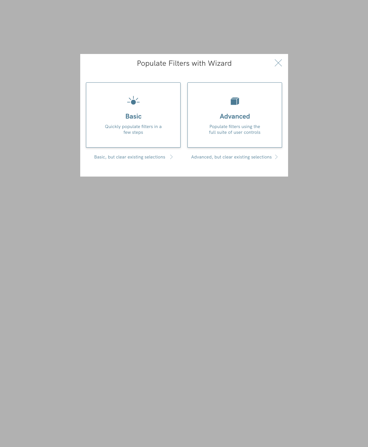
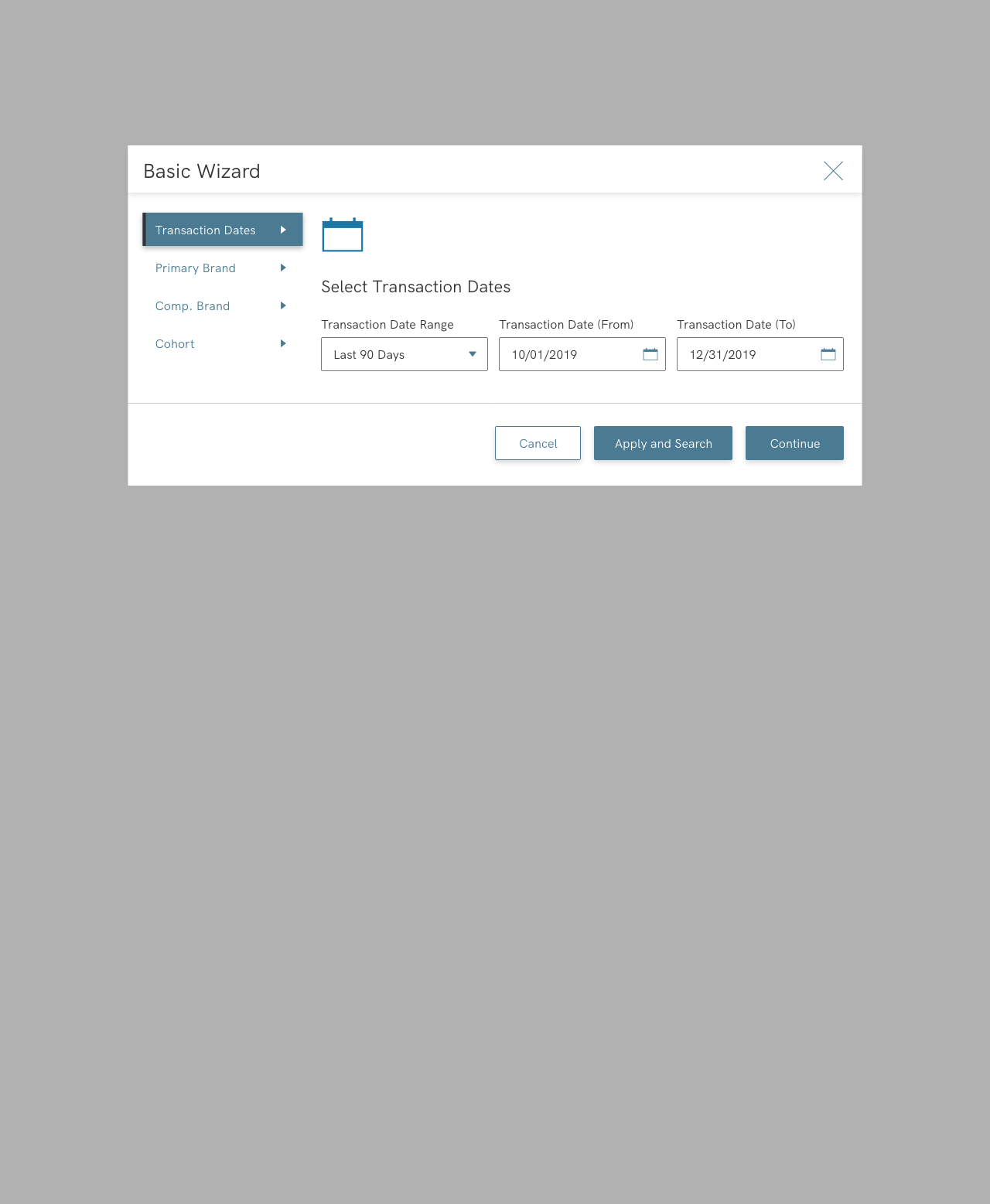
  • Basic users — I surveyed clients on the fields they use most, and their answers matched my direction. The result is four parent groups with just a few fields each, covering 50–60% of research in the system
  • Advanced users — A survey wasn't enough, so I interviewed users about real research scenarios. The result is six parent groups, with three fields per group where fields are complex (like multi-select). Familiar groups like Geography and Demographics stayed whole. These users drive 40–50% of research, so they got the same care
CE Vision Simple User Information Architecture
CE Vision Advance User Information Architecture

User flow

CE Vision SImple User UserFlow
CE Vision Advance User UserFlow
CE Vision Advance User Additional UserFlow
Process

Hypotheses

Cohort is optional

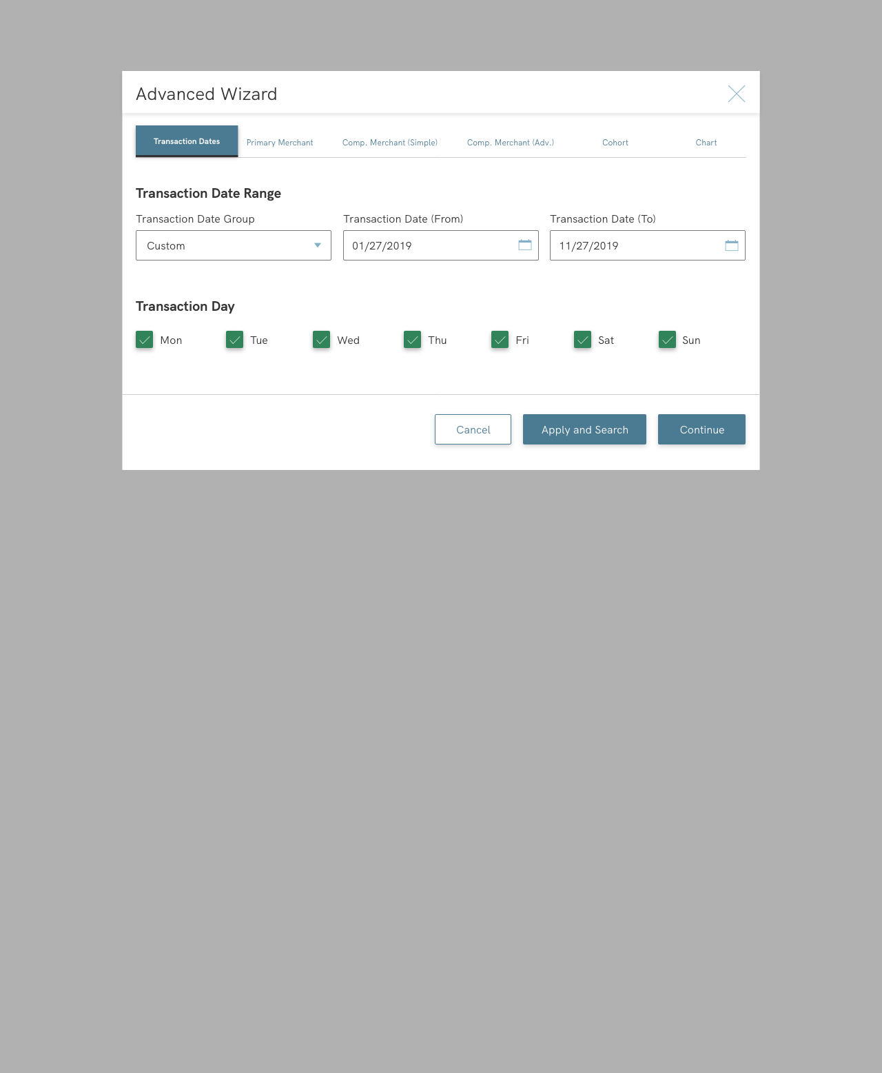
Most basic users skip cohort information, so cohort became an optional step in an already short four-step flow.

Core paths first

Advanced users have many paths. I isolated the core use cases so they could complete their tasks, and added a visual connection that ties Industry, Subindustry and Brand together as one group.

Explain, don't rename

The industry's terminology is standard, and competitors use it too, so instead of inventing new terms I added a clear explanation for each field.

Built to evolve

The proposed flow gave advanced users a strong foundation, built to evolve with continuous iteration after launch.

Innovations

  • Full action tracking

    Tracking went beyond Google Analytics to record every user action, data I used to understand advanced users' research process.

Final designs

Visual design

Colors

I redefined the existing primary colors to be accessible while staying on brand

Dark gray text with a lighter secondary gray

  • #333333
  • #666666

After reviewing the brand across marketing materials and company sites, I introduced a new color that's also accessible against white

  • #4B7A93

Typography

HK Grotesk

The application's original font: readable, and already familiar to clients

Buttons

PrimarySecondary